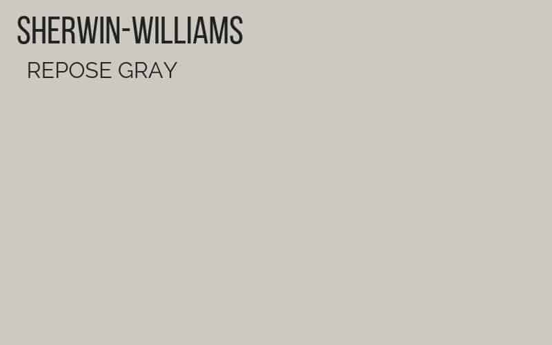
Repose Gray: Sherwin-Williams Repose Gray review and a side-by-side comparison with similar light gray paint colors. Plus, see what undertones this popular gray paint color has and the best way to pick a paint color!
REPOSE GRAY
Jump ahead to...
Repose Gray is a fantastic light gray paint color from Sherwin-Williams, and there is little doubt in my mind why it is one of their most popular gray paint colors. I included it on my list of the best gray paint colors AND my favorite greige paint colors because it is so fantastic! Below, I’ll share how it compares to some other Sherwin-Williams gray paint colors and popular Benjamin Moore paint colors including Revere Pewter (see the best Pewter colors here), and Agreeable Gray, so it’s easier to decide which is the right gray for you!
It has saved me hours of work and I wish I bought it sooner! Seriously! So many disagreements with my husband over painting would have been avoided!
MY FAVORITE TOOLS TO PAINT A ROOM FAST
This post contains some affiliate links for your convenience. Click here to read my full disclosure policy.
These tools have literally saved me DAYS of painting and cut my time painting by 66%! I only wish I knew about them and made the under $10 purchase before!
- Abrasive Hand Pad
- Use this instead of sandpaper. Using sandpaper will rub off too much of the varnish and the stain on your oak wood trim will permeate your newly painted white paint. We use these abrasive pads everywhere instead of sandpaper.
- Paint Pad–– save yourself HOURS by buying this under $10 painting tool!
- Paint Trim Guard
- You are going to want this if you have wall-to-wall carpeting or hardwood floors that you want to protect. I use it along with Painter’s Tape to ensure that I don’t have drips on my floor.
REPOSE GRAY UNDERTONES AND COMPARISON
First, we will look at some popular gray paint colors side-to-side so you can see how they compare. Next, we’ll see Repose Gray in real houses in a variety of lighting situations. But don’t forget to download my cheat sheet for picking the right paint color every time! I go through my tricks and my favorite gray paint colors!
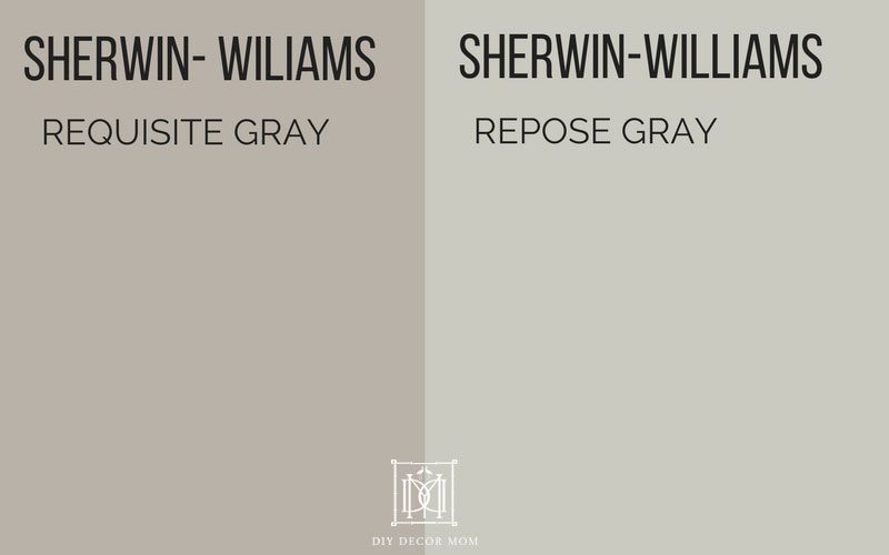
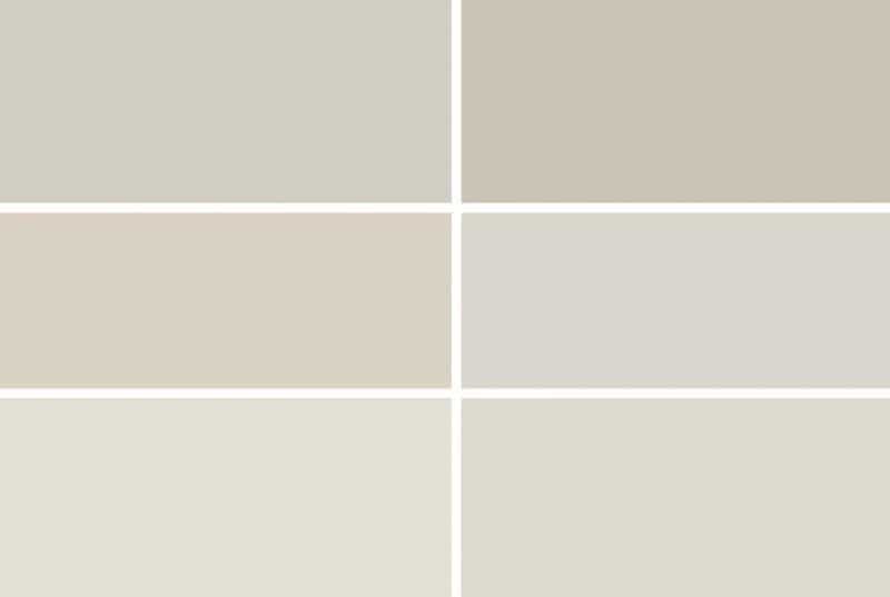
REPOSE GRAY VS. REQUISITE GRAY:
Sherwin-Williams Requisite Gray is another popular paint color and while it may seem very similar when you look at pictures, you can see below how much more green and blue Repose has than Requisite Gray (which has much more taupe).
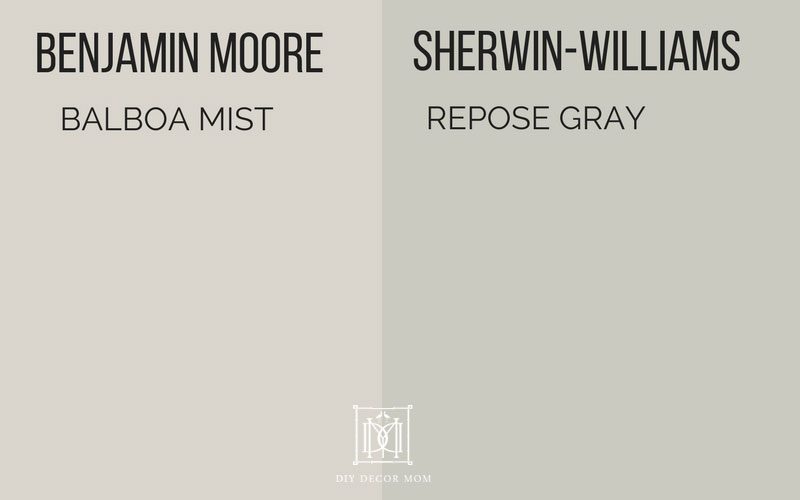
BALBOA MIST VS. REPOSE GRAY:
Balboa Mist by Benjamin Moore is one of my favorite paint colors (see my complete review of Benjamin Moore Balboa Mist here.) Balboa Mist compared to Repose Gray is much more of a true gray, and is much warmer. Repose Gray, on the other hand has more bluish-green tint to it.
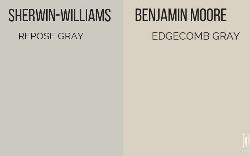
REPOSE GRAY VS. EDGECOMB GRAY:
Another popular light gray paint color is Benjamin Moore’s Edgecomb Gray, and like with Balboa Mist, you can see how much more “greige” Edgecomb Gray compared to Sherwin-Williams Repose Gray.
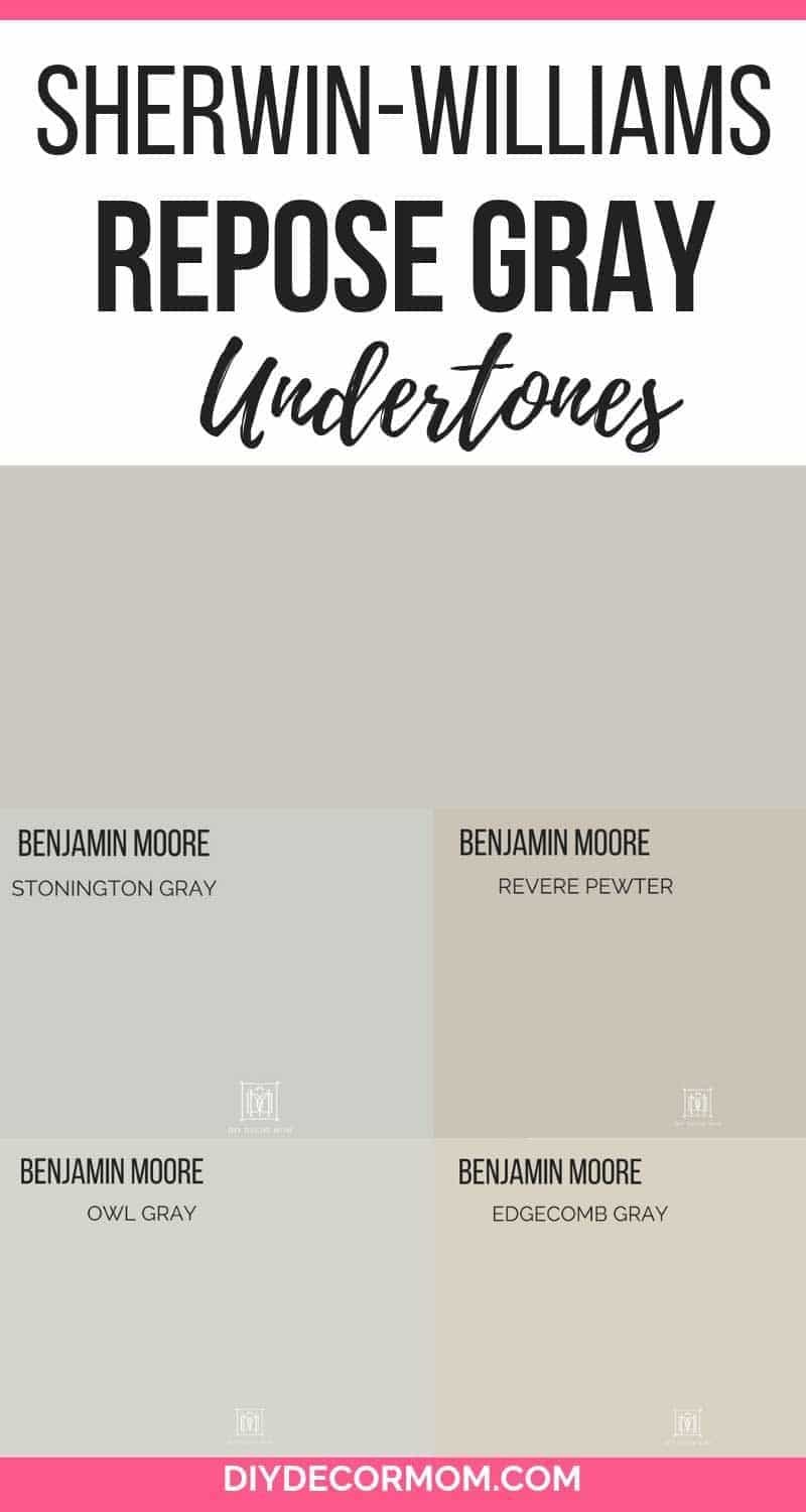
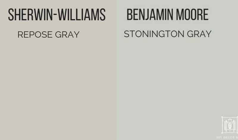
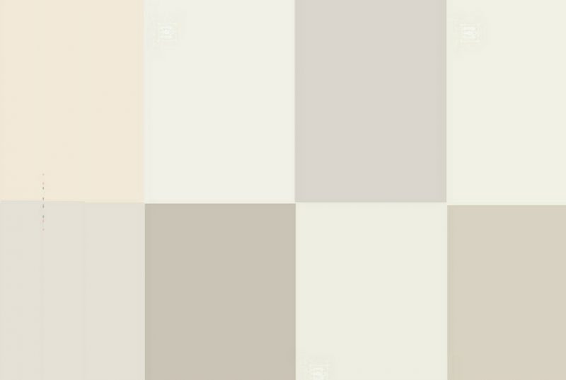
REPOSE GRAY VS. BENJAMIN MOORE STONINGTON GRAY:
These two paint colors completely surprised me. I’d always thought Repose Gray was a real bluish-gray; but, when you put it next to Benjamin Moore’s Stonington Gray, you can see how warm it is. Just shows you, it’s all about your frame of reference!
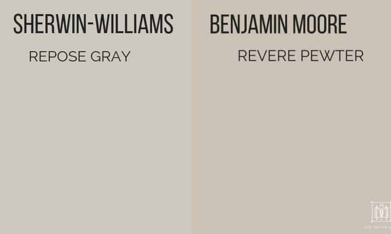
SHERWIN-WILLIAMS REPOSE GRAY VS. BENJAMIN MOORE REVERE PEWTER:
Benjamin Moore’s Revere Pewter is one of their most popular colors, so it’s interesting to compare it to one of Sherwin-Williams’ most popular colors, Repose Gray. Head to head, you can see with the paint chips below that Revere Pewter is much more similar to Edgecomb Gray than Repose Gray with significantly more taupe and brown in it. Repose Gray is a truer gray vs. Revere Pewter, which I consider a greige.
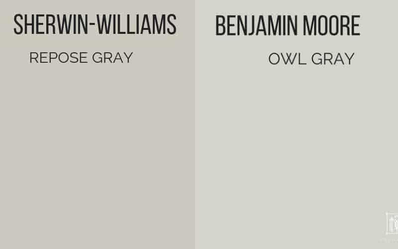
BENJAMIN MOORE GRAY OWL VS. SHERWIN-WILLIAMS REPOSE GRAY:
Another popular bluish-gray is Benjamin Moore’s Gray Owl, which you can see is very greenish-blue in comparison to Respose Gray. If you are looking for a warmer look, then I would recommend Repose Gray.
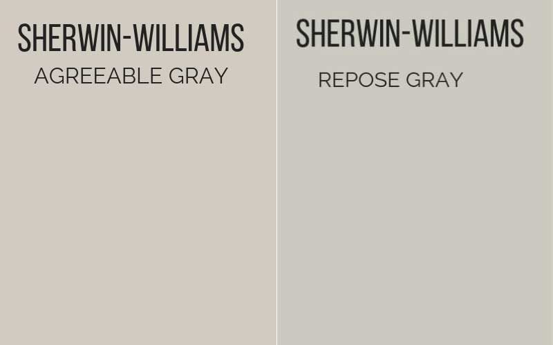
REPOSE GRAY VS. AGREEABLE GRAY
Two of Sherwin-Williams’ most popular paint colors, you can see below how the two compare. Agreeable Gray reads much more of a greige, and much warmer than Repose Gray. See my complete review of Sherwin-Williams Agreeable Gray here.

PAINT COLORS THAT GO WITH REPOSE GRAY:
Repose Gray is a fantastic neutral gray paint color that looks good in so many houses. Here are some of my favorite paint colors to make a whole house palette with it:
- Sherwin-Williams Agreeable Gray or Benjamin Moore Revere Pewter
- Benjamin Moore White Dove
- Sherwin-Williams Sea Salt
- Benjamin Moore Hale Navy
REPOSE GRAY IN REAL ROOMS:
See how Sherwin-Williams Repose Gray looks in a variety of lighting conditions and different rooms in the fantastic rooms by bloggers below. Click on the link to see the entire room reveal and go to their blog!
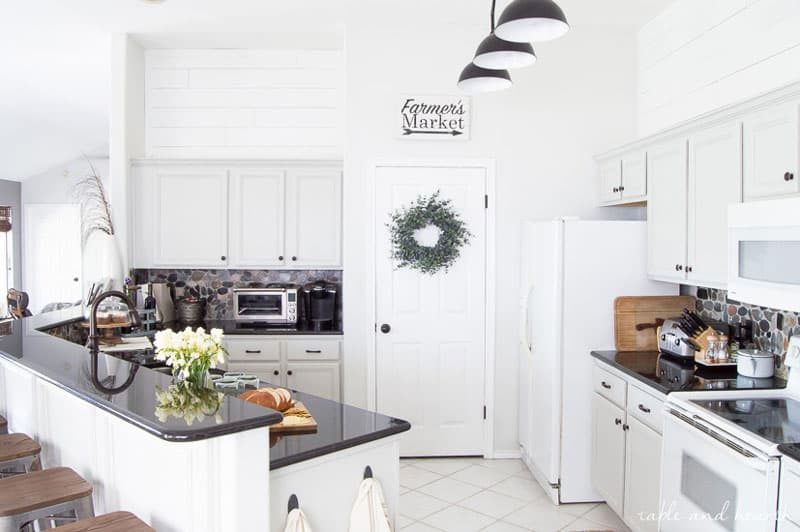
REPOSE GRAY KITCHEN CABINETS
Table and Hearth’s beautiful kitchen cabinets are painted Repose Gray here–what a transformation!
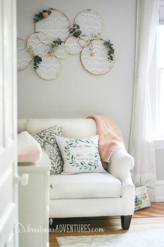
REPOSE GRAY BEDROOMS:
Christina’s Adventures gorgeous baby girl nursery is stunning painted Sherwin-Williams Repose Gray. It makes me want to redo our nursery!
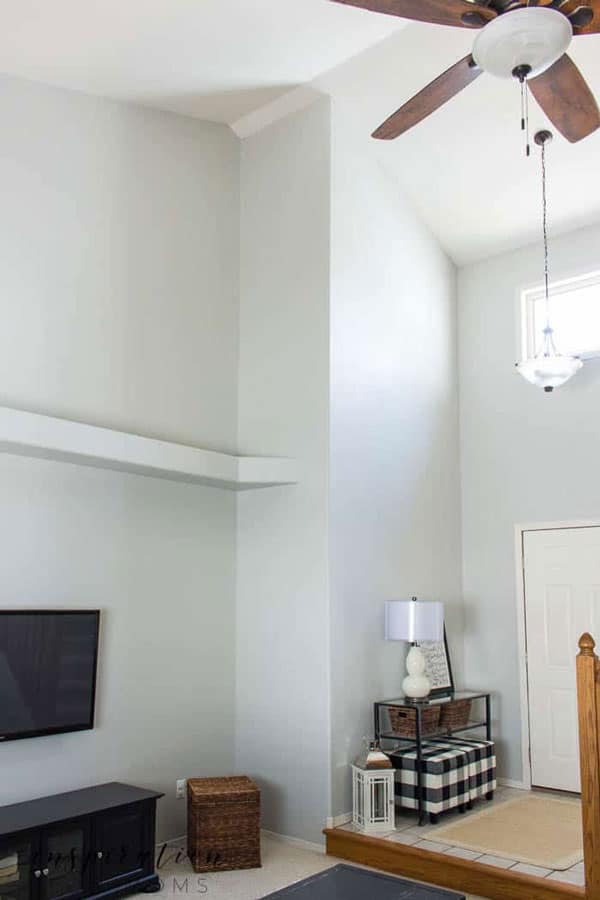
REPOSE GRAY LIVING ROOMS AND HALLWAYS:
Inspiration for Moms foyer and living room look lovely painted Repose Gray.
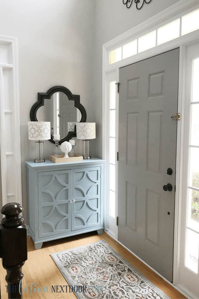
The Latina Next Door used Sherwin-Williams Repose Gray to update her foyer here.
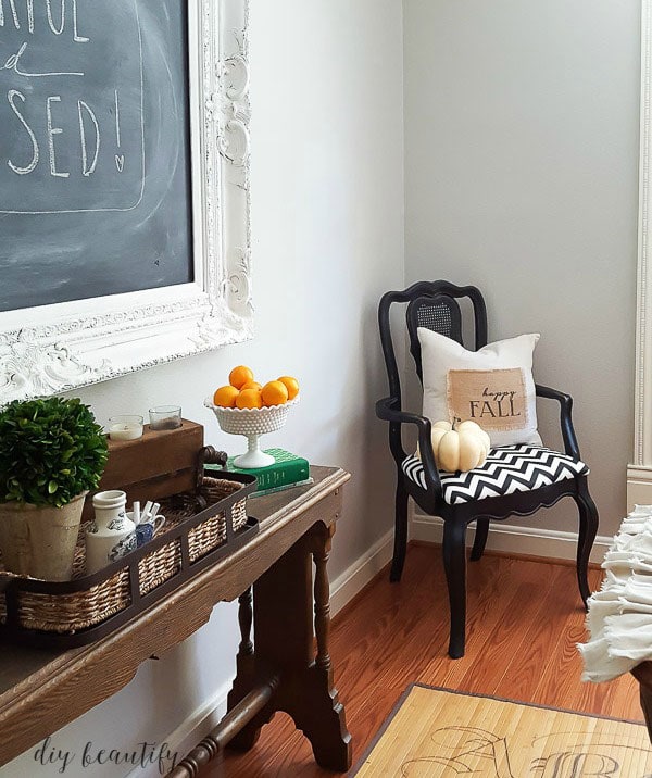
REPOSE GRAY DINING ROOM:
DIY Beautify used Sherwin-Williams Repose Gray in her dining room to great effect!
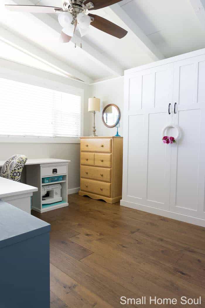
Girl Just DIY lovely office is painted Repose Gray here.
Still stumped on how to pick out a paint color?
Check out my best gray paint colors and tips for picking the perfect paint color every single time here! You can even download a printable paint chip list for both Sherwin-Williams and Benjamin Moore, which highlights their most popular light gray paint colors. No more going back to the paint store because you forgot to pick up a certain chip!
Make sure you don’t miss these great posts on other light gray paint colors:

You said you would put Agreeable grey in a north facing room and Repose grey in a south facing room. Will Agreeable grey look ok in a south facing room or will it look washed out? I would prefer to use one paint color (other than feature walls) but I also do not want the blue/green undertones.