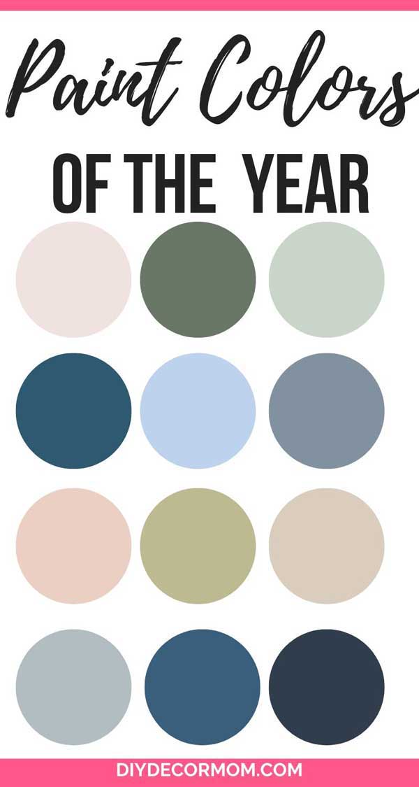
2020 Paint Trends and Colors of the Year: Want to know what paint colors are in style this year? All the most popular paint manufacturers recently released their Colors of the Year” and the results are below! Below, I’ll share my take on the best ways to use these stylish paint colors and the overall stylistic trends we are seeing as a whole in the design industry.
2020 PAINT TRENDS AND COLORS OF THE YEAR
Jump ahead to...
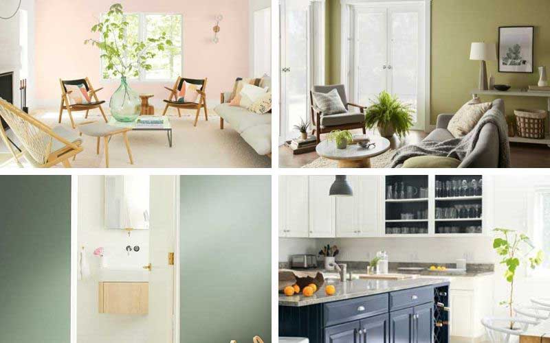
image credits: Benjamin Moore; Behr; Benjamin Moore; Benjamin Moore
First off, let’s go over what the colors of the year are, and you can see some striking similarities and trends.
Pantone: Classic Blue
While this isn’t a paint color, Pantone doesn’t manufacture paints, it does show that navy blue is hot! (See my favorite navy blue paint colors here.) And I will say it is very similar to Sherwin-Williams’ paint color of the year, Naval. (See my analysis of SW Naval here and how to use it in your home!)
*This post contains affiliate links at no cost to you see my disclosure policy here.
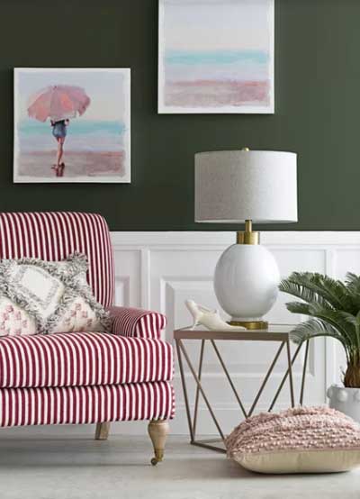
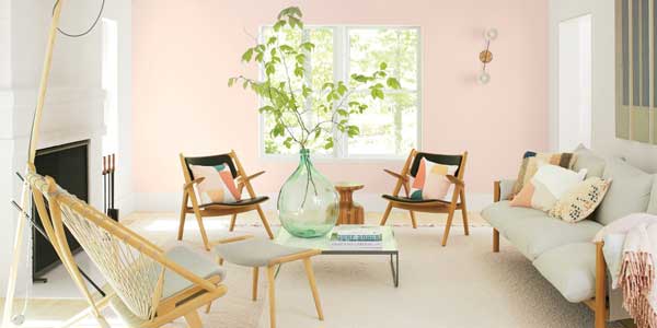
Benjamin Moore Color of the Year: First Light 2102-70
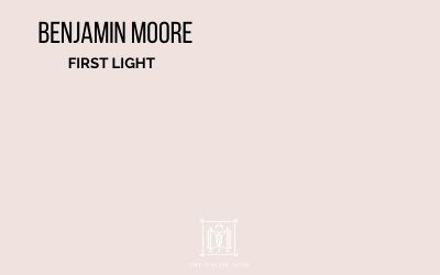
Benjamin Moore announced that “First Light,” a sweet pale pink with a touch of coral is their color of the year. It is very similar to “Millenial Pink” which was everyone’s favorite color for several years. It is a lovely color that is fresh-faced and perfect for a little girl’s room. It goes lovely with earthy sprouts of green as you see below–and is a fantastic color for a bedroom or a powder room. I would not recommend painting a major room such a statement color. Instead, add in with decorative objects like pillows, flowers, or accent pieces that feature the color.
Related: See my favorite pink paint colors here!
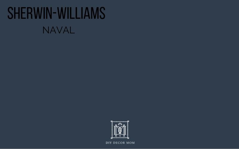
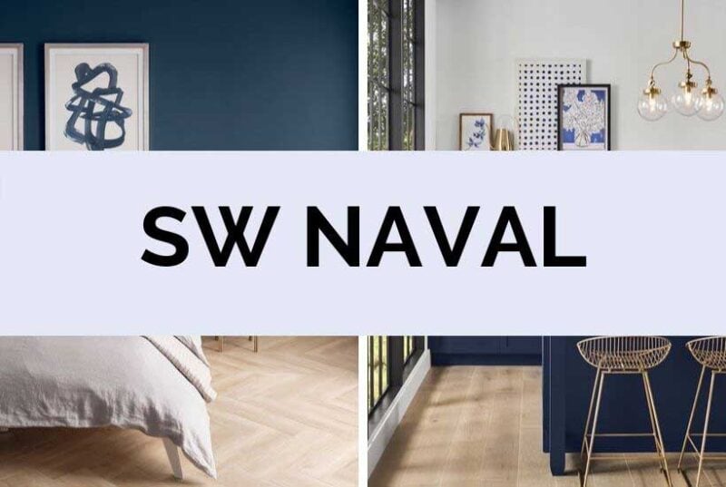
Sherwin-Williams: Naval
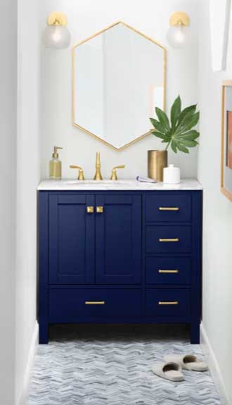
This past fall, Sherwin-Williams named SW Naval their color of the year. Like I said above, it looks remarkably like Pantone’s color of the year–Classic Blue. For years, SW Naval and Hale Navy have been my go to navy paint colors. It is a classic paint color that will never go out of style. See my complete review of it here including a recommended color palette.
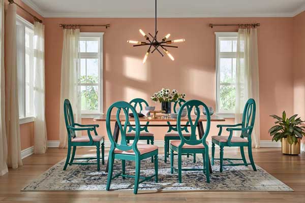
HGTV Sherwin-Williams: Romance

HGTV Sherwin-Williams (an offshoot and specific branch of Sherwin-Williams) named their color of the year, Romance, an earthy dark pink wthat reminds me of the Southwestern United States. This flesh colored paint color is quite a statement. It has a lot more orange in it than Benjamin Moore’s First Light, and is much more saturated. It could be good in small doses like in a bathroom as an accent color above wainscoting; but, I would not recommend painting an entire room this color.
Valspar Desert Fortress
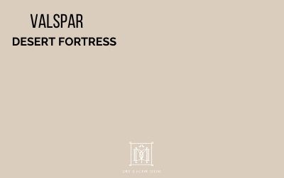
Hopping on the earthy and organic bandwagon, Valspar’s Desert Fortress is an organic paint color that brings back many of the beige colors of the early 2000s. Beige is making a comeback as evidenced by the transition to greige, and this beige paint color is evidence of that. Unlike the “band-aid” paint colors of the early 2000s, this beige has a lot of gray in it which makes it more current.
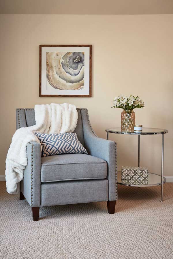
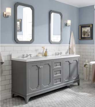
Valspar Grey Brook:
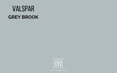
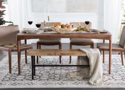
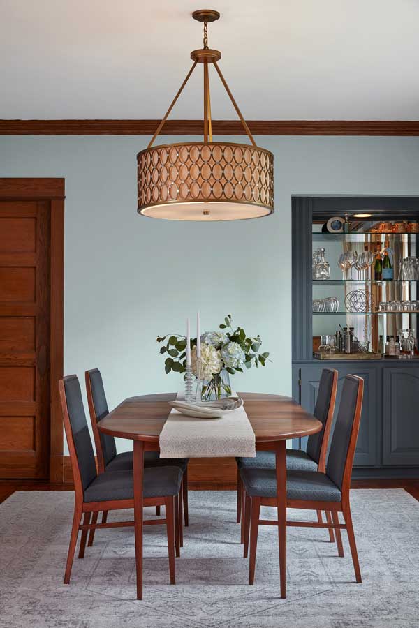
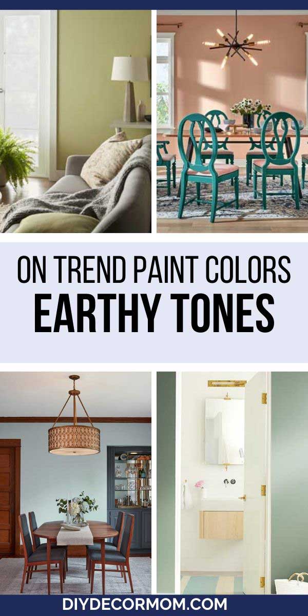
Like a few other paint companies, Valspar named two paint colors of the year. Their second choice was Grey Brook, which I like because it is a nice grayish blue. This pale blue paint color with gray and sage undertones looks good with wood tones (as you can see below), and has enough gray in it that it pairs well with other gray paint colors. It looks a little more greenish in the picture below, but I think that is just from the reddish wood tones.
Behr: Back to Nature
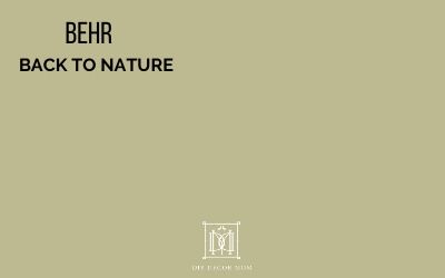
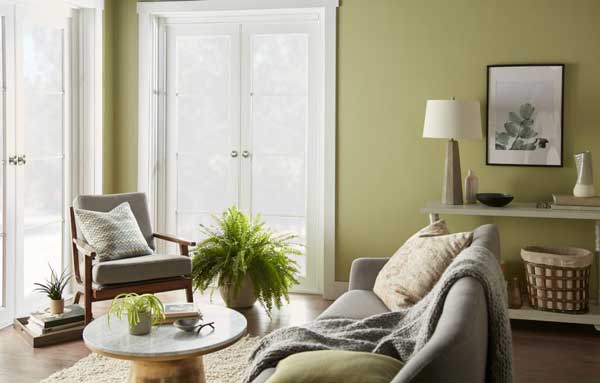
Behr’s Paint Color and design choice are obvious in the name, “Back to Nature.” This earthy sage with a yellow is a relaxing paint color for your home. It goes well with natural woven textures and wood tones.
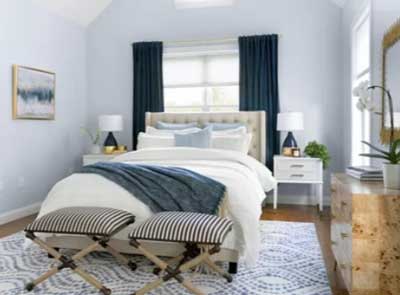
PPG: Chinese Porcelain- teal
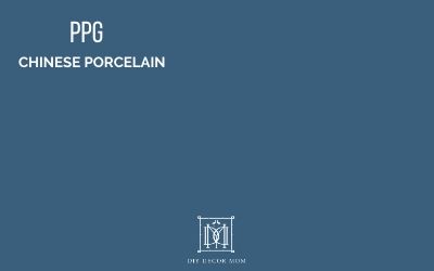
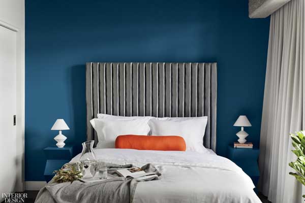
PPG announced that Chinese Porcelain is their color of the year, which is very similar to Pantone’s Classic Blue and Sherwin-Williams’ Naval; but, Chinese Porcelain is more of a teal and more reminiscent of peacock blue than those true navy paint colors. It is a warmer blue paint with more green in it than a true navy. It would look lovey in a bedroom (as seen below), or in a bathroom or dining room.
Benjamin Moore’s Other Paint Colors of the Year:
Benjamin Moore also released their complementary paint colors here with their top 20 paint colors of the year making up a lovely palette. Here are my picks
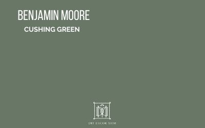
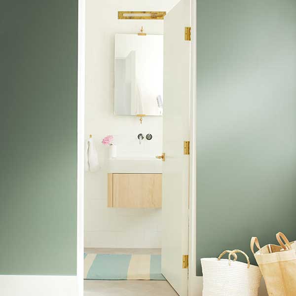
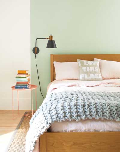
- Cushing Green is a relaxing green paint color with lots of gray in it. Similar to Behr’s Back to Nature, this sageish paint color is very grounding (but, has less yellow.)
It pairs really well with soft white paint colors and warm golds as seen below. It would also be a fantastic paint color for kitchen cabinets or a butler’s pantry.
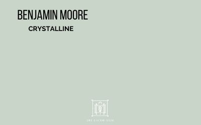
- Crystalline is a lighter green paint color with lots of blue in it. It goes nicely with Cushing Green, but is airier. It also has a lot of gray in it, and it is a relaxing paint color that goes well in master bedrooms and bathrooms.
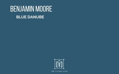
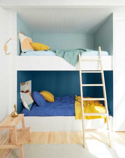
- Blue Danube is very similar to PPG’s Chinese Porcelain, another teal for the year. It is a very saturated paint color, so I would reserve it for “statement making” rooms of your house like an accent wall in a kid’s bedroom or a dining room. To balance out its darkness, use it above board and batten paneling or wainscoting.
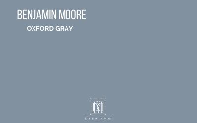
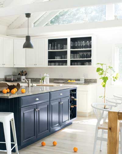
- Oxford Gray is a color I have have a resurgence lately. It is one of my favorite blue gray paint colors because it is so versatile. Look how lovely it looks on the kitchen island below. In that light, it reads really dark but it’s not. It’s a lovely mature bluish gray.
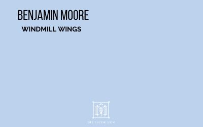
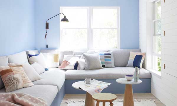
- Windmill Wings is such a sweet paint color. While I don’t think I would paint an entire living room or family room it, I can see it being darling in a nursery and as an accent color. French blue is in, (it’s been on the return for the last several years), and this perwinkle-esque blue paint is a softer version of it! I love using it in non-traditional ways like painted cabinets in a laundry room or in a girls bedroom.
2020 Color Trends:
Below, I am breaking apart the two main trends I see for 2020 paint colors: earthier vignettes and blues.
Earthier Colors:
As you can see above, what you have is a return to warmer earthier colors. The Fixer Upper “stark white” paint colors days are over. While people still like airy, neutral paint colors for their homes (it’s what I recommend for interior paint colors), the design pendulum is slowly swinging back.
These earthy organic colors like Behr’s Back to Nature, HGTV Sherwin-Williams’ Romance, and Valspar’s Grey Brook seen above are evidence of it. In the home design industry, you will see a return of wood accents, woven textures and baskets, and earthy green paint colors. These are relaxing grounding colors that anyone can benefit from.
Earthy paint colors of the year:
- HGTV Sherwin-Williams Romance
- Valspar Grey Brook
- Behr Back to Nature
- Benjamin Moore Crystalline
- Benjamin Moore Cushing Green
Easy Ways to Add Earthy Tones to Your Home:
Light blues and navy
The second trend I see above is the number of blues that are included. Pantone named Classic Blue as the color of the year and Sherwin-Williams named Naval their pick, so there is obviously something going on! Pair this with the resurgence you see of everything blue and white, and a softer alternative–light blue.
Related: See the best navy paint colors here.
Blue Colors of the Year:
- SW Naval
- Pantone Classic Blue
- BM Windmill Wings
- BM Oxford Gray
- Valspar Grey Brook
- PPG Chinese Porcelain
- BM Blue Danube
Light Blue Decor Picks for Your Home:
Related: See all my favorite light blue paint colors here.
 Overall Paint Color Trends for 2020
Warmer Colors for 2020:
A third trend I see happening (that isn’t completely reflected in the picks above) is a transition away from cool gray paint colors, to warmer gray paint colors and greige. The popularity of blue gray paint colors like SW Stonington Gray is moving towards warmer greiges like Edgecomb Gray and Revere Pewter. You can see a nod towards this transition with Valspar’s Color of the Year, Desert Fortress.
Related: Best Warm Grays
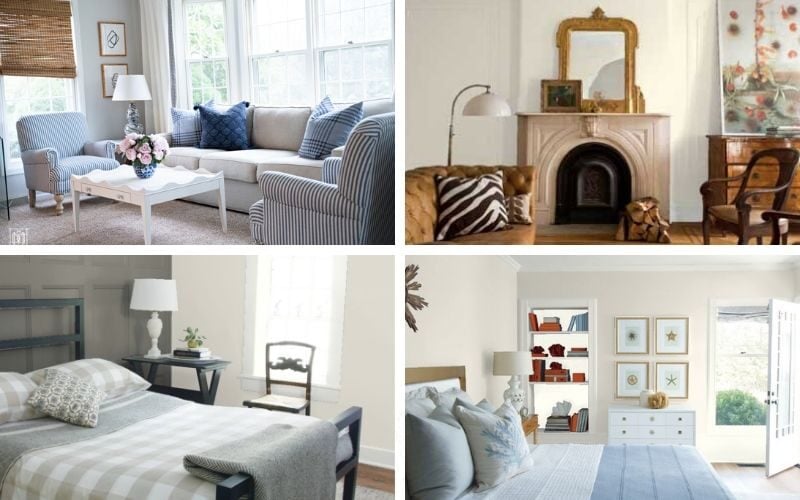
While cool gray paint colors have had their time the last ten years, people are learning towards greige (gray and beige) paint colors. Less “Band Aid-esque” than the beige paint colors of the early 2000s, these sophisticated gray beige blends are lovely and versatile and say anything but “builder grade.” See my favorites below!
Related: Best Greige Paint Colors
Dramatic moody colors and trim:
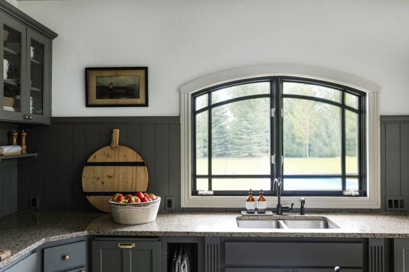
A fourth trend I see happening is painted trim and moody kitchens. This goes along with White with a return to earthier colors. Chris Loves Julia shows us a prime example below with their “Modern Cottage Kitchen.”
Related: See my favorite kitchen cabinet colors and paints to use here.
Wallpaper Returns
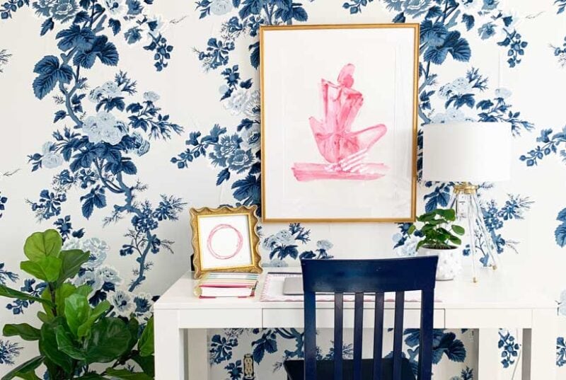
And last but not least–wallpaper! If you haven’t seen the resurgence of wallpaper then, you might be living under a rock. Wallpaper is back! And it does not look anything like the 1988 wallpaper you ripped out. Chintz is returning, and florals are coming back! See my favorite places to buy wallpaper online and my current favorites here.
