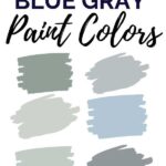
BLUE GRAY PAINT: Looking for the perfect blue gray paint color for your house? These bluish-gray paints are the overall winners in designer’s own houses, and I’ve rounded up the best of the best shades that go with a variety of home decor styles!
BLUE GRAY PAINT
Jump ahead to...
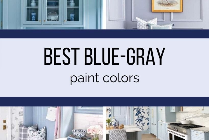
Below, you’ll find the top blue gray paint colors from Sherwin-Williams, Behr, and Benjamin Moore. We’ve used a number of them in our house as well, which I will show you (see my favorite dark blue paint colors here!) You’ll also find paint chip comparisons, light value numbers, and my top tips on foolproof paint picking (no one wants to have to repaint a room!)
WHY ARE BLUE-GRAY SHADES SO POPULAR?
Blue gray paints are some of the most soothing and lovable paint shades out there. They are constantly recommended by interior designers and paint experts to use in bedrooms, bathrooms, and even home offices because of their calming effects.
Supposedly, sky blue is the most relaxing paint color; but pale shades of blue with of gray undertones are equally soothing wall colors.
And maybe because we all could use a little calming in our lives, do we find that light blue gray and moody slate grays are one of the hottest paint colors of the year.
The gray undertones lend blue shades a more sophisticated slant. Plus, light bluish-gray tones go with a variety of home decor styles whether your house is modern/ industrial, coastal bohemian, or traditional!
GRAB ALL YOUR PAINT SAMPLES HERE–-no painting walls or going to the paint store necessary!
*affiliate links have been used at no cost to you see my complete disclosure policy here.
Below, I’ve rounded up the best bluish-gray paints from each of the top paint manufacturers, included my personal comments and recommendations on it, shared complementary colors, and the LRV of the paint color.
WHAT ARE THE MOST POPULAR BLUE-GRAY PAINT COLORS?
There is no doubt that blue-gray is the “it” color of the year! But, unlike other previous colors of the year, these have staying power! Here are the most popular colors broken down by manufacturer, and then grouped below by tone.
BENJAMIN MOORE BLUE GRAY TONES
- Providence Blue 1636
- Flower Box CSP-530
- Tranquility AF-490
- Whispering Spring 2136-70
- Van Courtland Blue HC-145
- Smoke 2122-40
- Cloudy Sky 2122-30
- Water’s Edge 1635
- Silver Gray 2131-60
- Santorini Blue 1634
- Boothbay Gray HC-165
- Solitude AF-545
- Windy Sky 1639
- Brittany Blue 1633
- Nickel
- New Hope Gray
- Pike’s Peak
SHERWIN-WILLIAMS BLUE GRAY SHADES
- SW Krypton
- SW Rock Candy
- SW Upward
- SW Misty
- SW Windy Sky
- SW Gray Screen
- SW Marilyn’s Dress
BEST BEHR BLUE GRAY PAINT COLORS
- Light French Gray
- Thundercloud S520-5
- Tranquil Pond PPU15-07
LIGHT GRAY-BLUE PAINT TONES
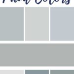
These light gray paint colors all have a touch of blue to them–but they key is that they are grayish blue (not bluish gray.)
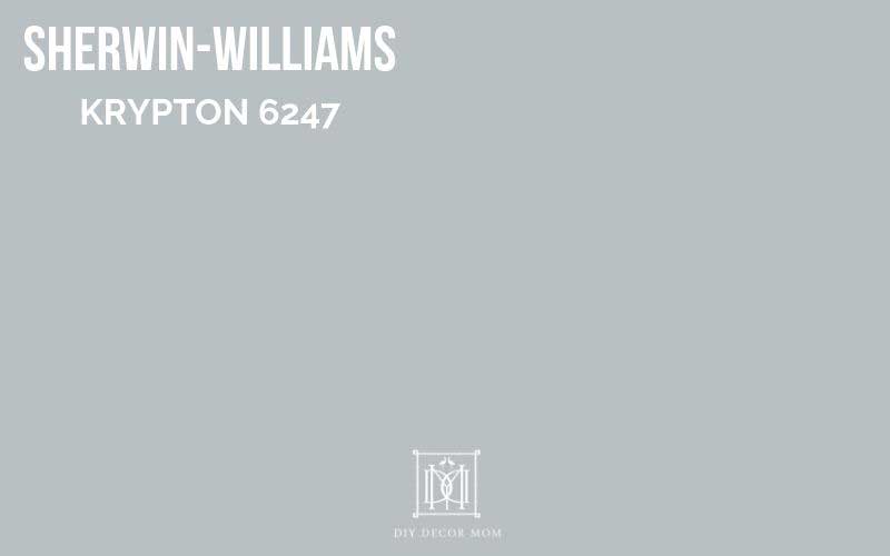
SW Krypton 6247
LRV: 52
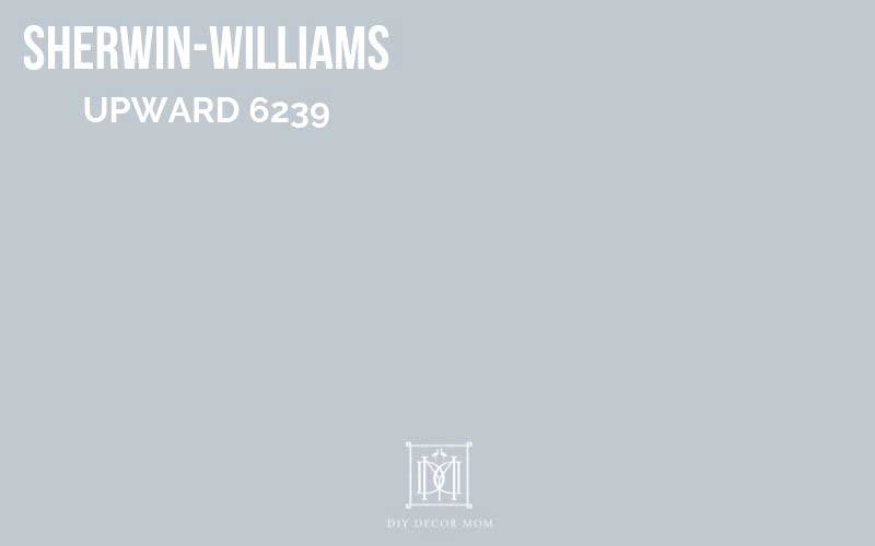
SW Upward 6239
LRV: 45
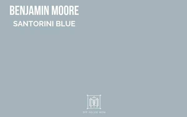
BM Santorini Blue
LRV: 45
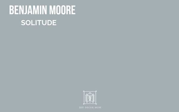
BM Solitude
LRV: 42
DARK BLUE-GRAY PAINT COLORS
Below, you’ll find the best darker blue-gray paint colors from Sherwin-Williams and Benjamin Moore. Depending on the light conditions, these will read more or less blue. However, as you can see by comparing them to the paint shades listed above–these have much more blue in them than gray.
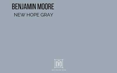
BM New Hope Gray
LRV:
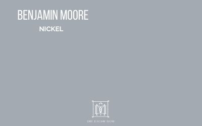
BM Nickel 2119-50
LRV:
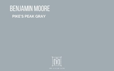
BM Pike’s Peak Gray
LRV:
BM Flower Box
LRV:
BM Providence Blue
LRV:
BM Van Courtland Blue
LRV:
GET YOUR SAMPLE HERE
BM Cloudy Sky
LRV: 32

BM Water’s Edge
LRV: 30
LIGHT BLUE COLORS
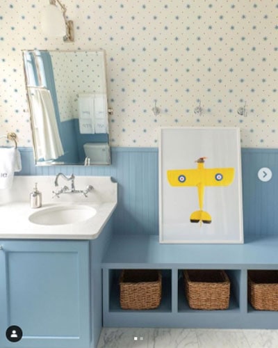
These light blue paint colors have just a touch of gray in them–which make them read more sophisticated than a basic light blue. We’ve used these light blue paints in bathrooms, bedrooms, and even cabinets!

BM Whispering Spring
LRV: 79
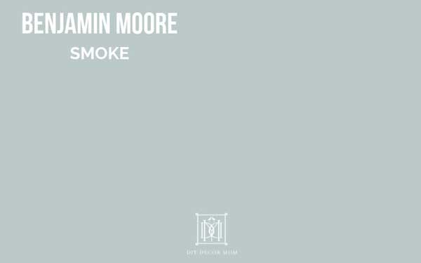
BM Smoke
LRV: 56
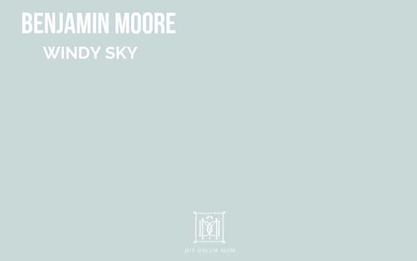
BM Windy Sky
LRV: 66
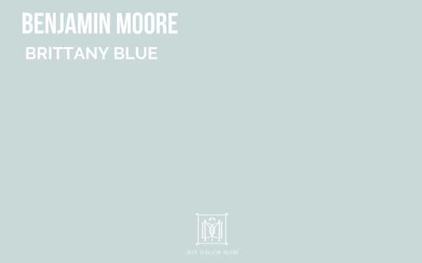
BM Brittany Blue
LRV: 62
BM Lake Placid
LRV:
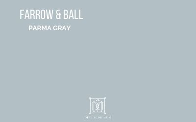
Farrow & Ball Parma Gray
LRV:
LIGHT GRAY-BLUE SHADES
These blue-gray paint shades have a minimal amount of blue and are more gray paints with a blue hue. Their LRV are higher than others on the list, which means that they are usually brighter colors that will read happier.
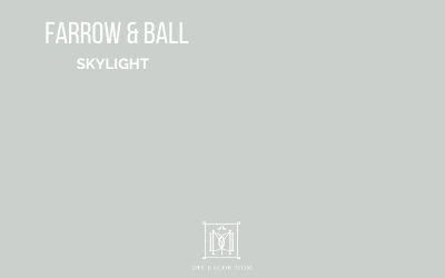
Farrow & Ball Skylight
LRV: 75
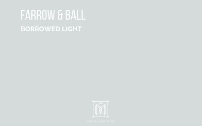
Farrow & Ball Borrowed Light
LRV: 75
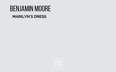
BM Marilyn’s Dress
LRV:
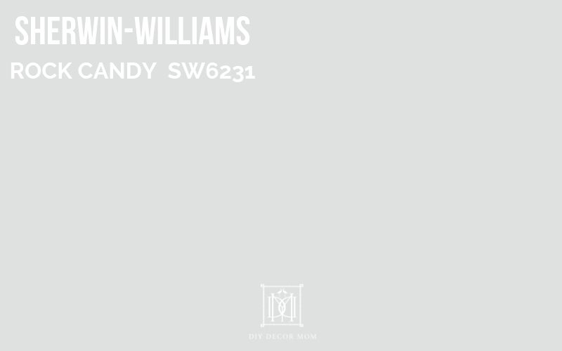
SW Rock Candy 6231
LRV: 75
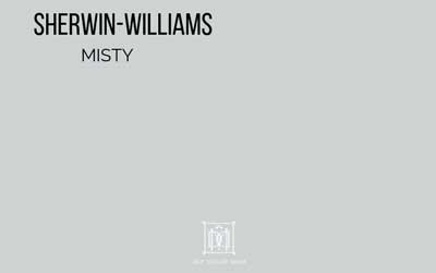
SW Misty 6232
LRV: 64
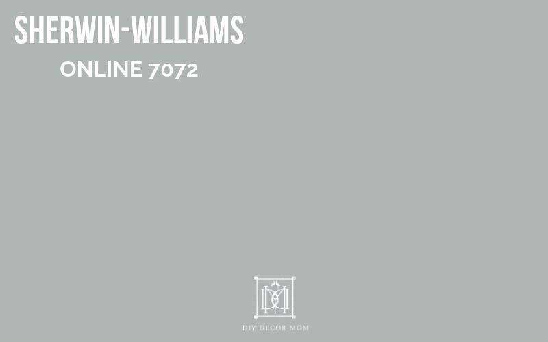
SW Online 7072
LRV: 45

SW Icicle
LRV:

SW Gray Screen7071
LRV:
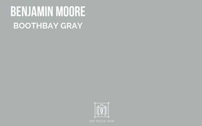
BM Boothbay Gray
LRV: 43
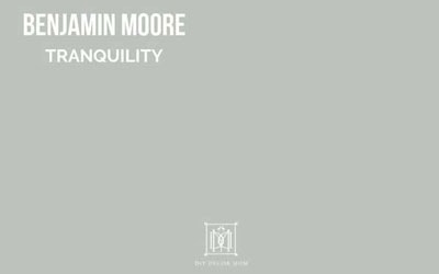
BM Tranquility
LRV:
What is LRV?
What is LRV? LRV is an acronym for light reflective value, and it means just that–it measures how much light a certain paint color allows to reflect. The lighter the color, the higher the LRV is. Personally, I don’t stress too much about it, but it’s a good way to have a quantitative measure of how light a color is, and is helpful when trying to compare and choose paint colors.
HOW TO PICK OUT DUSTY BLUES
Ok, so this is a tip for picking out ANY paint color: look at a paint chip and examine the most saturated paint color on the chip. Most likely, you’ll notice the undertones of that paint color more easily when you see the most saturated tones. (Scroll down to see the easiest way to get good accurate samples!)
For example, look at Benjamin Moore’s Santorini Blue below (it’s the one with the check.) Next to it are similar paint shades–as you go to the right, it gets more and more concentrated. You can see that there is a smidge of green in there but that it is a pretty true bluish-gray and it almost looks slate-like when it’s super concentrated. Studying the undertones in this way will give you a good idea of whether or not the paint color is what you are looking for.

Of course, don’t forget to get a big sample and take the paint swatch around to different walls in your room so you can see how the light interacts with it. And bring it alongside any home decor or furniture you are planning to use or planning to buy!
PSST! Want to know a secret? You can totally do this another way and save yourself a trip to the store, and washing paintbrushes!
HOW TO GET BLUE-GRAY PAINT SAMPLES
As much research as you can do online, it’s best to get a sample and see the paint colors in your own house. Light affects paint colors so much, the same paint color can look very different in two different rooms–Classic Gray (no natural light) looks so much different in my back mudroom than it does in our front hallway (southern exposure.)
In the past, I’ve always recommended going to your local paint store, snagging some samples and painting a large swatch of paint on a poster board, and then carrying the poster board room to room.
But, now, there is a much easier way…
it requires no schlepping to the paint store, no washing paintbrushes, and no wondering if you painted enough (ensuring you have a true representation of the color…)
—->>>Instead, I recommend you CHECK OUT SAMPLIZE HERE!
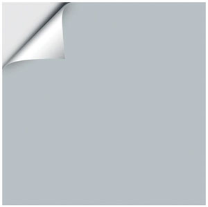
Samplize will send you 12″x12″ paint samples that you peel and stick on your walls. At $5.99 a sample, it cheaper than my going to the paint store, buying samples, brushes, and poster boards. Plus, it’s way EASIER and LESS MESSY!
Reasons Why I Love Samplize:
- Less Mess and Clean-up
- Color correct–they are a true representation of the colors because they are made with two coats of paint.
- More affordable and time-friendly than buying samples/ making samples.
Samplize samples will arrive at your doorstep within 1-3 days from the time you order them! and of course easier and way less messy
Light Blue Gray Shades:
The following wall paint colors from Benjamin Moore and Sherwin-Williams are what you might consider light blue-gray paint colors. They are either gray with a hefty dose of blue, or blues with a lot of gray in them. Scroll down to see details of each paint color including paint chips, complementary color schemes, LRVs (light reflectance values) and even see real rooms with the paint on the walls.
GRAB A SAMPLE OF IT HERE
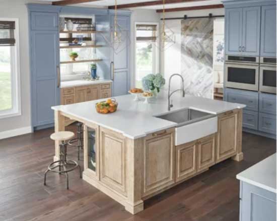
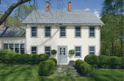
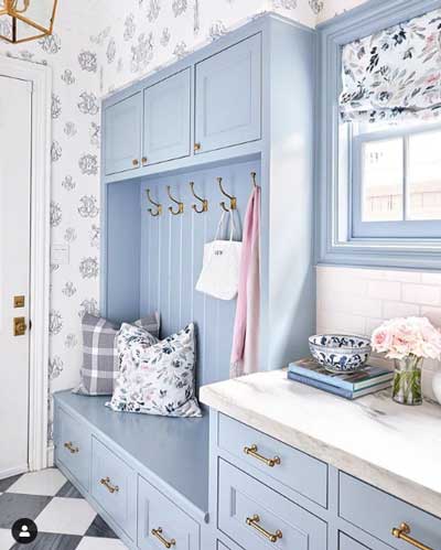
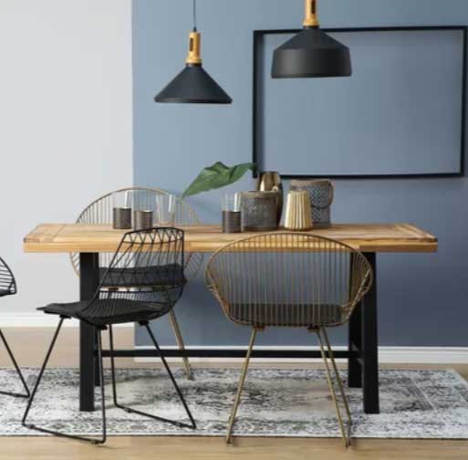
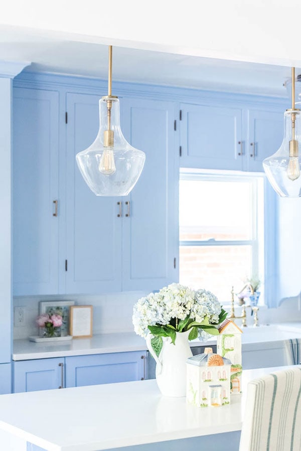
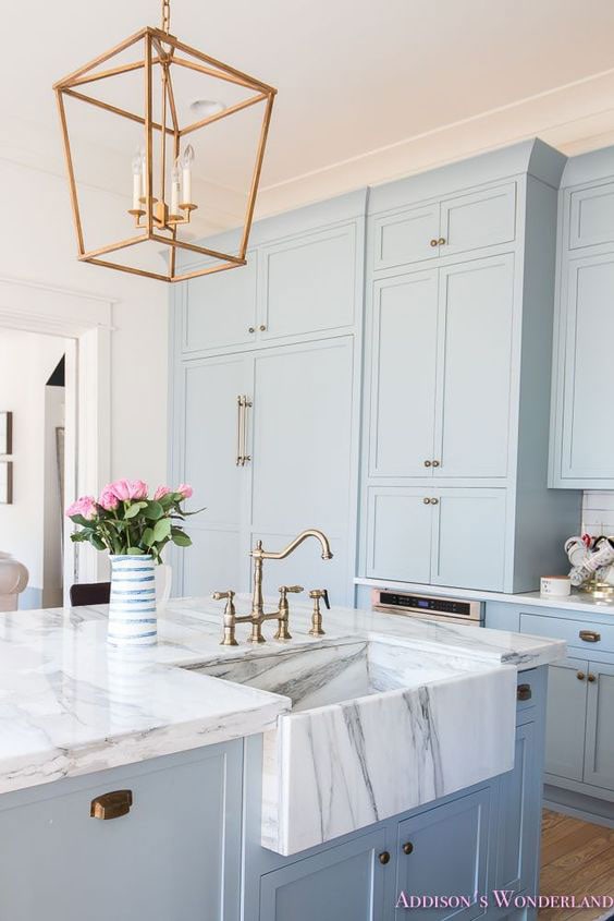
You can see above how versatile bluish-gray paint tones are! They go with any home decor style including contemporary or modern/ industrial or traditional! Depending on your home decor style, you’ll want to pick a paint tone that fits with your overall aesthetic!
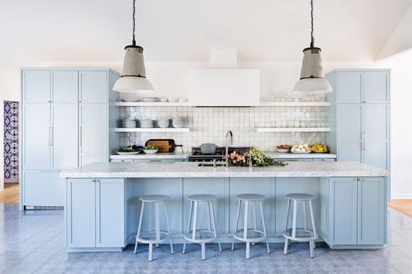
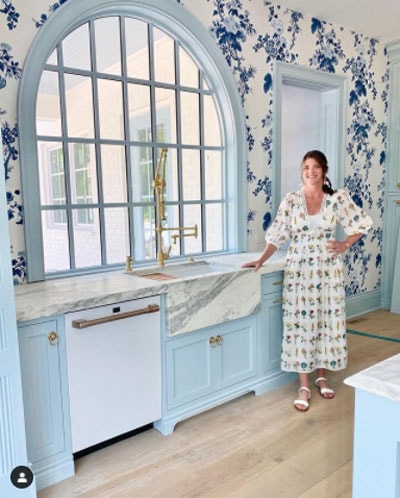
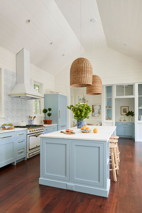
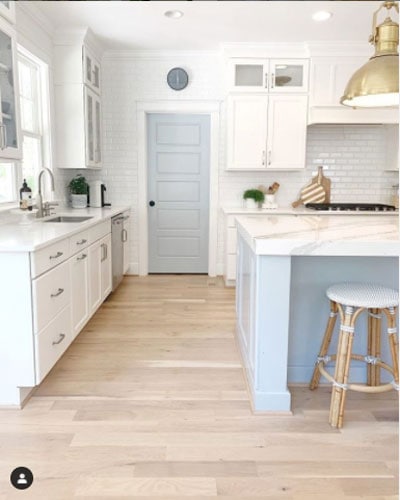
BEST BLUE-GRAY PAINT SHADES FOR KITCHENS
Bluish-gray kitchens are one of the hottest trends this year–see all my favorite picks here.
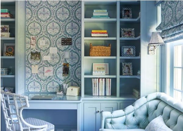
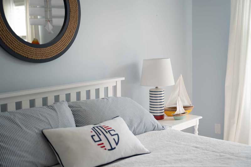
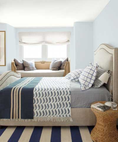
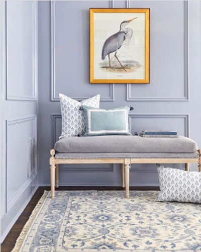
BEST GRAY-BLUES FOR OFFICES AND BEDROOMS
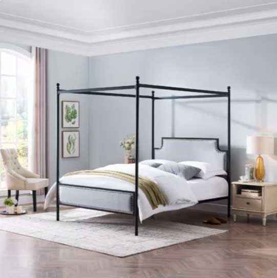
Blues are known for their calming effects–and what better place to be calm than your bedroom or your office? The best blue paint shades aren’t too dark or too light and leave you feeling refreshed!
Related: See the best paint colors for bedrooms here
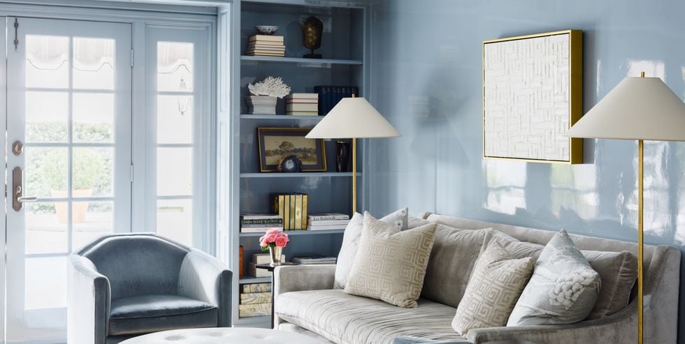
BEST BLUE-GRAYS FOR DOORS AND WALLS
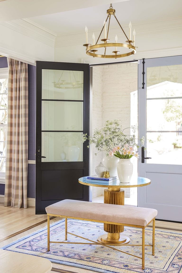
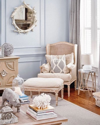
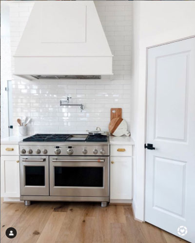
SHERWIN-WILLIAMS LIGHT BLUES
- SW Krypton
- SW Rock Candy
- SW Upward
- SW Misty
- SW Windy Sky
—>>>>Get 12″x12″ paint samples of all these Sherwin-Williams paints here!<<<—
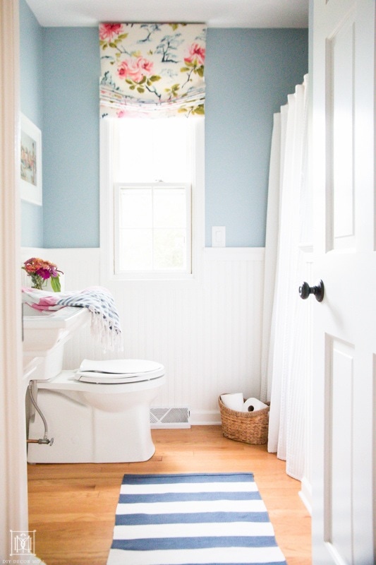
Benjamin Moore Light Blue Shades
-
- BM Whispering Spring
- BM Smoke
- BM Brittany Blue
- BM Tranquility
- BM Santorini Blue
Light bluish-grays look great on kitchen cabinets–see the top picks for kitchen cabinet paint colors here! While navy blue cabinets have dominated the last several years, we are seeing a general return to softer muted colors and lighter shades of blue for cabinetry.
Darker Grayish Blue Paint Tones
These darker, more saturated paint colors are moody and dramatic. They are fantastic to use in rooms where you either want a little drama or you’d like to feel cozy.
Benjamin Moore Darker Blue Shades
- BM Providence
- BM Boothbay Gray
- BM Water’s Edge
- BM Van Courtland Blue
- BM Flower Box
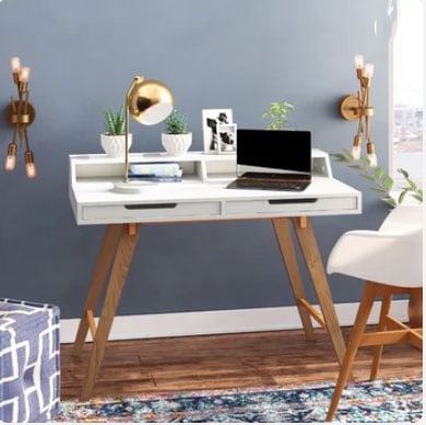
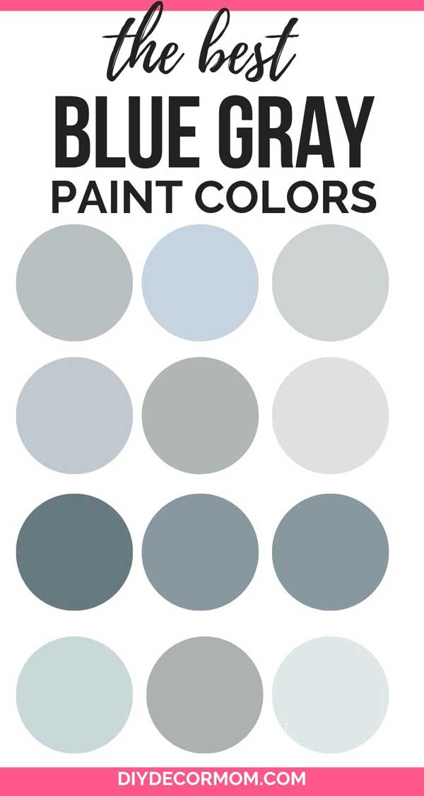
LIGHT SHERWIN-WILLIAMS LIGHT BLUE-GRAY:
- SW Rock Candy 6231
- SW Misty 6232
- SW Online 7072
- SW Gray Screen 7071
BLUE GRAY PAINT BEHR:
Behr has a lovely collection of paint colors available at your local Home Depot. Here are my favorite bluish gray paint colors that look great in any home!
- Light French Gray
- Thundercloud S520-5
- Tranquil Pond PPU15-07
BLUE GRAY PAINT BENJAMIN MOORE
- Providence Blue 1636
- Flower Box CSP-530
- Tranquility AF-490
- Whispering Spring 2136-70
- Van Courtland Blue HC-145
- Smoke 2122-40
- Cloudy Sky 2122-30
- Water’s Edge 1635
- Silver Gray 2131-60
- Santorini Blue 1634
- Boothbay Gray HC-165
- Solitude AF-545
- Windy Sky 1639
- Brittany Blue 1633
DARK BLUE GRAY PAINT COLORS FROM BENJAMIN MOORE
BM NEW HOPE GRAY


BM NICKEL

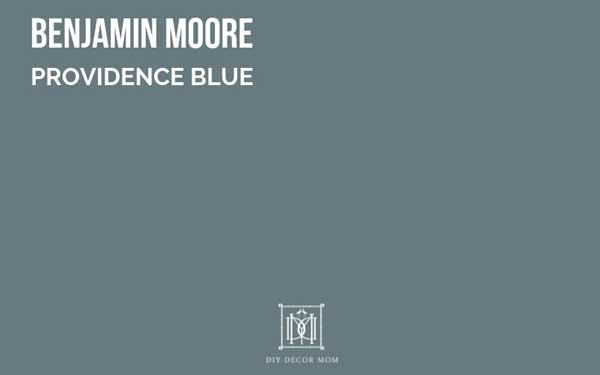
BM PROVIDENCE BLUE 1636
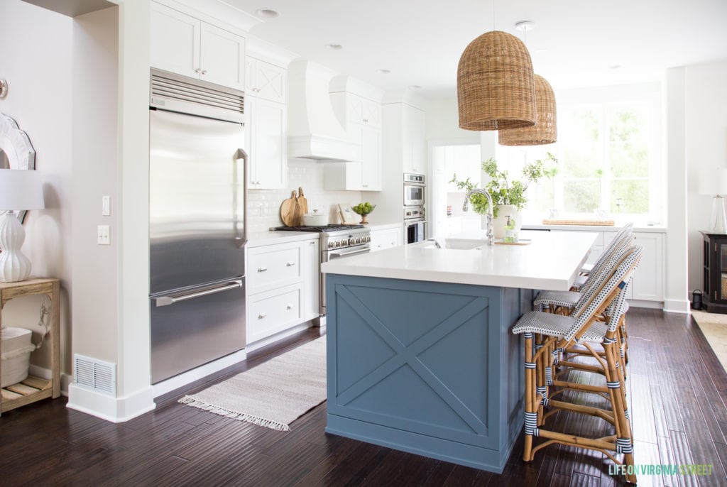
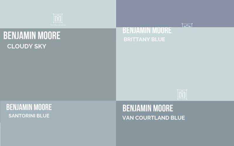
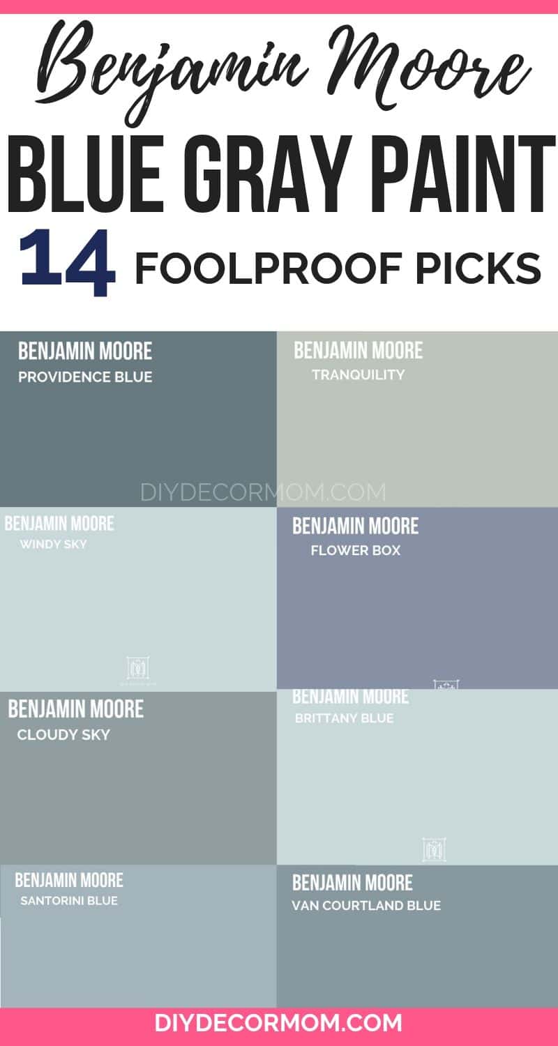
Benjamin Moore Providence Blue is a sophisticated bluish gray with a slight tint of green. It lends itself to well coastal whole color house schemes and looks lovely with many shades of white. It is ideal as an accent color for kitchen islands, bathrooms, and kitchen cabinets.

Colors that go with BM Providence Blue: Benjamin Moore Simply White, Benjamin Moore Edgecomb Gray, Benjamin Moore White Dove,
GET A SAMPLE OF PROVIDENCE BLUE
BM BLUE JEANS
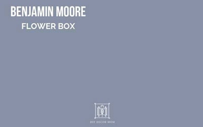
BM FLOWER BOX
A lovely grayish blue paint color, BM Flower Box has a touch of lavender in it that gives it warmth and makes it ideal for bedrooms, bathrooms, and other rooms that you would like to feel cozy. It goes really well with “clean” feeling white colors like BM White Dove.
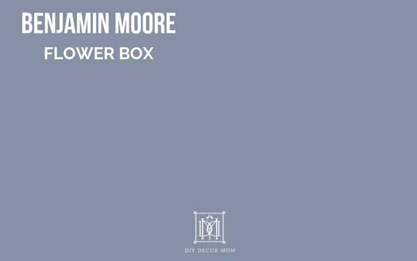
Colors that go with Benjamin Moore Flower Box: Benjamin Moore Edgecomb Gray, Benjamin Moore White Dove, Benjamin Moore Balboa Mist
GET A SAMPLE OF FLOWER BOX HERE HERE
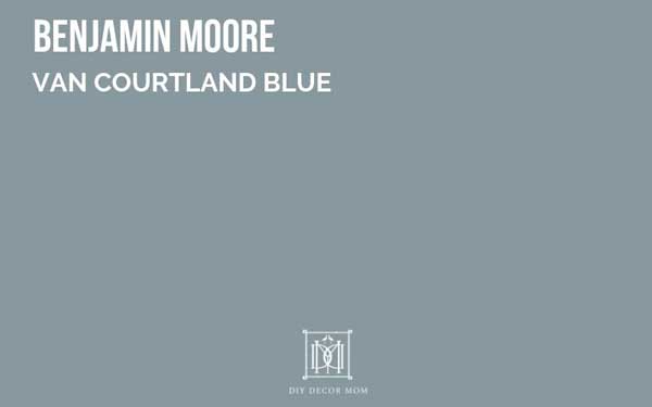
BM VAN COURTLAND BLUE
Benjamin Moore Van Courtland Blue is a steelier version of a grayish-blue paint color. Less lavender coloring than BM Flower Box, as you can see above, it is a more versatile color in my opinion. It looks exceptional with bright whites and grays, it is ideal for painting kitchen cabinets and bathroom cabinets (see the best colors for cabinets here.) It also looks lovely in a dining room with white paneling or board and batten.
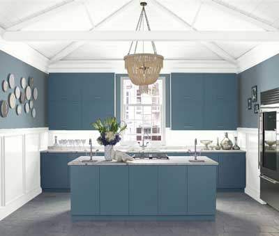

BM WATER’S EDGE
Benjamin Moore Water’s Edge is very similar to Van Courtland Blue (shown above).
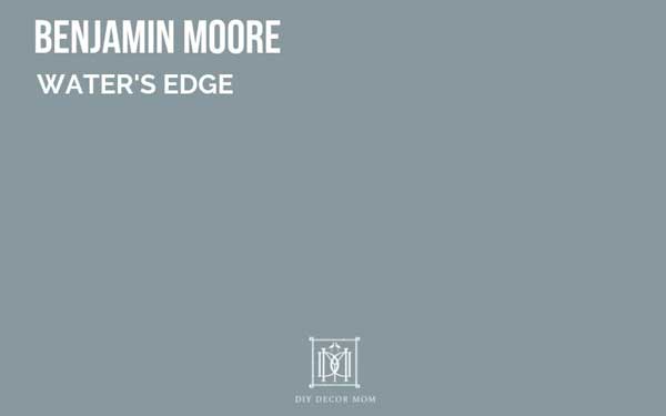
Blue Colors that go with BM Water’s Edge, and both have the exact same LRV. Both colors work well in stately rooms or rooms that you want to add some drama. I love using both bluish gray paint colors as an accent color in kitchens, dining rooms, and bathrooms.
LRV: 30.42
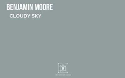
BM CLOUDY SKY:
BM Cloudy Sky has a similar darkness to Water’s Edge and Van Courtland Blue, but it has less blue in it and more gray, which makes it more versatile as a wall color. You can even see a slight undertone of green in it, which I think adds to its sophisticated coloring.
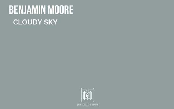
BM Cloudy Sky looks fantastic with a plethora of neutral paint colors including BM Revere Pewter, BM White Dove, and BM Edgecomb Gray.
LRV: 32.34
BM SANTORINI BLUE

Benjamin Moore Santorini Blue is a versatile coastal color that lives up to its name! It has less green in it than BM Cloudy Sky and is a truer bluish/ gray paint color–almost periwinkle-esque. It looks lovely with light gray paint colors as well as white paints.

Colors that go with BM Santorini Blue: Benjamin Moore Simply White (a fresh white paint color) and BM Hale Navy
LRV: 45.02

BM SOLITUDE AF-545
More of a grayish paint color than Santorini Blue, but with a similar LRV (light reflective value). Solitude would look lovely in bedrooms, living rooms, and dining rooms, or bathrooms as a relaxing palette.

Colors that go with BM Solitude: BM Classic Gray and BM Edgecomb Gray
LRV: 42.17
BM TRANQUILITY AF-490
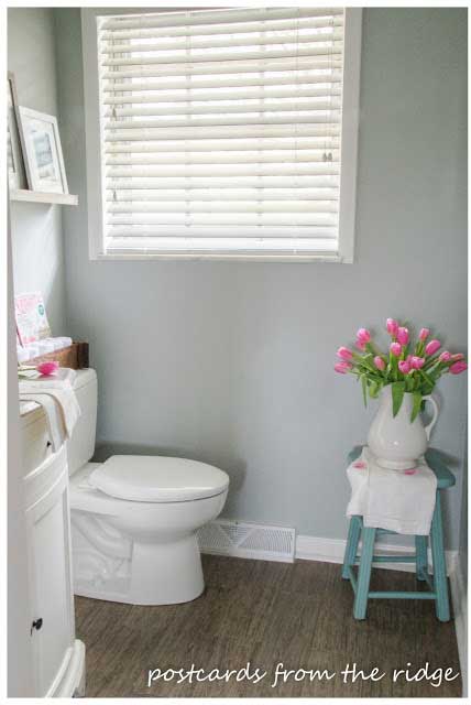
BM Tranquility lives up to its name–a tranquil and serene gray paint color with a hint of blue. You can see how it is much less bluish than BM Solitude, and would look lovely in a variety of rooms and light conditions.

Colors that go with BM Tranquility: BM White Dove (goes with everything), BM Simply White (would look excellent as trim), and Hale Navy (a lovely deep navy blue paint)
LRV: 53.9
BM BOOTHBAY GRAY HC-165
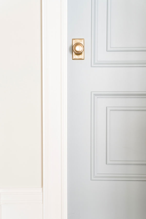
Boothbay Gray reminds me a lot of BM Metropolitan Gray–both are sophisticated gray paint colors with a good amount of bluish coloring. More than many of the other bluish gray paints, I consider Boothbay Gray a real gray with just a smidge of blue.
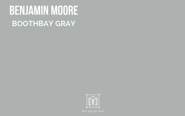
Colors that go with Benjamin Moore Boothbay Gray: Boothbay Gray looks excellent with bright crisp white paint colors like BM Simply White, and equally as well with my favorite greige paint colors.
LRV: 43.36
LIGHT BLUE GRAYISH PAINT COLORS FROM BENJAMIN MOORE
BM WHISPERING SPRING
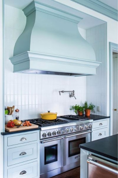
Colors that go with BM Whispering Spring: Benjamin Moore Revere Pewter, Sherwin-Williams Sea Salt (slightly more greenish), BM Hale Navy, and BM Simply White
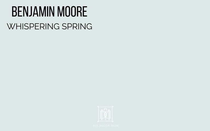
LRV: 79.37
BM SMOKE

Colors that go with BM Smoke: BM Hale Navy (always great as an accent color) or see more of my favorite navy blue paint colors here, BM White Dove (a softer white), BM Balboa Mist
LRV: 56.49
GET SAMPLE HERE
BM WINDY SKY

Benjamin Moore Windy Sky has a bit of green in it. It is a great coastal color that looks excellent as a stand-alone color in a room, or with a bright white trim like board and batten or beadboard like we did in our beadboard bathroom. It is also fantastic in bathrooms or bedrooms; but, I would shy away from it in living rooms and family rooms because it is so blue (I prefer using more neutral colors in our major living areas of the house.)
Colors that go with BM Windy Sky: Pairing a blue with a white paint color always looks good, and Greige paint colors look fantastic with it as well! Sherwin-Williams Repose Gray is also a favorite!
LRV: 66.45
BM BRITTANY BLUE
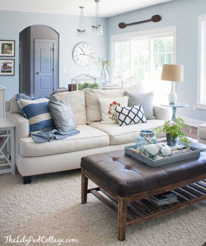
Benjamin Moore Brittany Blue is very similar to Windy Sky, but it has slightly less of a greenish undertone. It looks lovely in bedrooms and bathrooms and has a young feeling to it that comes off as refreshing.
Colors that go with BM Brittany Blue: With the greenish undertones, I like to stay with cooler colors like navy blues as a complement, and crisp whites like BM Decorator’s White, BM Simply White, or BM White Dove as a soft white.
LRV: 62.42

FAQs on the BEST BLUE GRAY PAINT COLORS:
What is blue-gray color called?
Blue Gray paint colors are blue paint colors with a heavy concentration of gray undertones, or gray paint colors with a lot of blue in them. They often look hardened or “steel like”
What is the best blue gray paint color?
While I can’t say what the best blue gray paint color is, I can tell you the most popular ones: Sherwin-Williams Misty, Behr Light French Gray and Benjamin Moore Silver Gray. With that you can make up your own mind with what works for your home–but I would encourage you to try more than just those three paint colors. Are you still stumped? See how to pick paint colors here–the foolproof guide!
What is the most popular gray color of paint?
Revere Pewter is one of the most popular gray paint colors currently (see more pewter paint colors here.)
What are warm gray colors?
Warm gray paint colors are in some ways the opposite of blue-gray paint colors. They give a warm feeling versus a cooler feeling. Revere Pewter is one of my favorite warm gray paint colors, and you can also try greige paint colors (gray/ beige) which also have a lot of warmth.
BEST TOOLS FOR PAINT A ROOM FAST
Having the right tools is half the battle–or I should say 2/3 of the battle. Seriously, after buying this under $15 tool, I shaved 67% of the time required to paint a room. My only regret? Not buying it sooner! It makes my lines so clean and makes cutting-in or tying-in a breeze!
This post contains some affiliate links for your convenience. Click here to read my full disclosure policy.
TOOLS FOR PAINTING LIKE A PRO
These tools have literally saved me DAYS of painting and cut my time painting by 66%! I only wish I knew about them and made the under $10 purchase before!
- Abrasive Hand Pad
- Use this instead of sandpaper. Using sandpaper will rub off too much of the varnish and the stain on your oak wood trim will permeate your newly painted white paint. We use these abrasive pads everywhere instead of sandpaper.
- Paint Pad–– save yourself HOURS by buying this under $10 painting tool!
- Paint Trim Guard
- You are going to want this if you have wall-to-wall carpeting or hardwood floors that you want to protect. I use it along with Painter’s Tape to ensure that I don’t have drips on my floor.
Want some more guidance on picking out the right paint color THE FIRST TIME? See my foolproof guide to picking winning paint colors here.

I loved you tip about balboa mist and classic grey. I was going to use them to repaint my dad’s entire condo; some rooms were dark without too much light and that’s where I was going to use the classic grey. However, when I went to the paint store the sales lady convinced me to use silver satin instead of the classic grey. I was sorry I listened to her.
I am thinking of painting the basement SW Rock Candy. It will be the boy’s playroom area. You mentioned SW Misty goes well with it. Could you explain this better? Do you mean on other walls? Thank you!